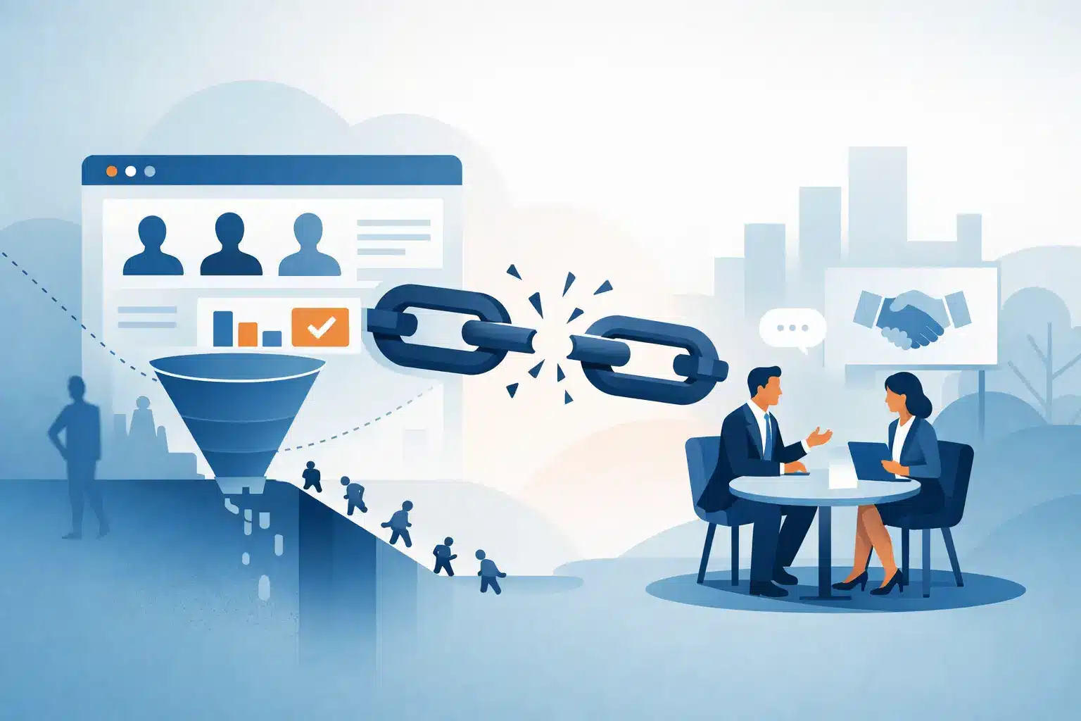
A prospect lands on your website with a real need, a few minutes between meetings, and several alternatives open in other tabs. If they cannot quickly tell whether you understand their problem and what to do next, they leave. That is why websites lose leads: not always because the business lacks demand, but because the online experience creates uncertainty at the exact moment a visitor needs confidence.
For small and mid-sized businesses, this can be especially frustrating. You may be investing in search, paid ads, referrals, social media, and networking, only to send interested people to a website that does not carry the conversation forward. A website should not simply look polished. It should help the right prospect recognize value, trust the business, and take a meaningful next step.
Why Websites Lose Leads: The Real Issue Is Friction
Most lead loss is not caused by one dramatic problem. It is the cumulative effect of small points of friction: vague language, slow-loading pages, a generic contact form, missing proof, or a call to action that asks too much too soon. Each issue gives a visitor one more reason to delay. In a competitive market, delay often becomes departure.
The strongest websites behave like a prepared member of your sales team. They answer the questions a prospect is already asking: Is this for a company like mine? Can they solve my specific problem? Are they credible? What will working together look like? What should I do now?
When those answers are difficult to find, visitors are forced to do the work. They must interpret broad claims, hunt for details, compare scattered service pages, or guess which person to contact. Good marketing reduces that burden. It gives prospects a clear path from initial interest to informed action.
Your Message May Be Clear to You, but Not to Buyers
Business owners live close to their services. Terms that feel obvious internally can be unclear to an outside visitor. Phrases such as “innovative solutions,” “full-service support,” or “results-driven strategy” may sound professional, but they rarely explain what the buyer receives or why it matters.
A stronger opening message identifies who you serve, the problem you help solve, and the outcome clients can expect. For example, a B2B service company should not lead only with a list of capabilities. It should make clear whether it helps organizations improve operations, reduce risk, grow revenue, retain customers, or solve another pressing business challenge.
Specificity is not about making your audience smaller for the sake of it. It is about helping the right people feel recognized. A visitor who sees their situation reflected in your language is more likely to keep reading, explore your process, and start a conversation.
Service Pages Need More Than a Service Description
Many websites lose leads because their service pages read like brochures. They define the offering, list a few features, and stop there. Prospects also need context: when they should consider the service, what challenges it addresses, what the engagement involves, and what success can look like.
This does not mean every page needs to promise identical outcomes. Results depend on a client’s market, budget, sales cycle, and starting point. But your website can still explain the practical value of your work and set realistic expectations. That level of clarity builds trust before the first call.
Visitors Cannot Find a Clear Next Step
A lead does not always begin with a request for a proposal. Some visitors are ready to schedule a consultation. Others want to review examples, ask one question, subscribe for insights, or understand pricing expectations. A website that offers only “Contact Us” may miss people who are interested but not yet ready for a major commitment.
Every high-priority page should guide the visitor toward one logical action. That might be requesting a consultation, calling the office, submitting an inquiry, or downloading a useful resource. The action should match the page and the visitor’s level of readiness.
Too many choices can also create hesitation. If every page presents several competing buttons, visitors may not know where to begin. Make the primary action visually and verbally clear, then provide secondary options only when they genuinely support the decision process.
The form itself matters. A long form can discourage busy prospects, particularly on mobile. Ask only for information your team needs to respond thoughtfully. You can gather deeper details during the follow-up conversation. The goal is to start a qualified exchange, not make someone complete an application before they know whether there is a fit.
Trust Signals Are Missing or Buried
When someone is considering a service provider, they are evaluating risk. They want to know whether your team is credible, responsive, experienced, and capable of delivering on its promises. Claims alone cannot do that work.
Trust is built through visible evidence: client testimonials with meaningful details, case examples, professional team information, recognizable certifications where relevant, clear processes, and proof of industry experience. A short testimonial that says “great service” is better than nothing, but it is far less persuasive than a client explaining the challenge, the working relationship, and the result.
Place proof close to decision points. If a visitor is reading about a service, show evidence that you have solved similar problems. If they are considering a consultation, reassure them about what happens next and what they can expect from your team. Trust signals should support the page’s purpose, not sit alone on a testimonial page that few people visit.
For relationship-driven businesses, the human element is also essential. Prospects are not only buying a deliverable. They are choosing who will advise them, communicate with them, and represent their interests. Team photography, real bios, and an honest explanation of how you work can make a business feel accessible and accountable.
Technical Problems Quietly Reduce Conversion
A slow, confusing, or broken website sends an unintended message: this business may be difficult to work with. Visitors may never phrase it that way, but their behavior reflects it. They abandon pages, fail to submit forms, or leave before seeing your strongest information.
Mobile performance deserves special attention. Many prospects will first encounter your company on a phone after a referral, a search, or a social post. If text is hard to read, buttons are difficult to tap, forms do not function, or important content is hidden, you are losing opportunities before your sales team has a chance to respond.
Speed is part of the same experience. Large images, unnecessary scripts, outdated plugins, and poorly organized pages can make a site feel heavy. Not every page must be stripped down to the minimum, especially for brands that rely on visual storytelling. The trade-off is balance: use strong creative assets while protecting load time and usability.
It is also worth checking the basics regularly. Test forms, confirmation messages, phone links, calendar tools, analytics tracking, and notification emails. A form that appears to work but never reaches your team is not a minor website issue. It is a direct lead-generation failure.
Traffic Quality and Website Strategy Must Work Together
Sometimes the website is not the only reason leads are weak. If ads, SEO content, social posts, or referral partners attract people who are outside your ideal market, even an excellent website will struggle to convert them. The message that brings a visitor in must align with the message they see when they arrive.
For example, an ad promising a quick, low-cost fix should not send traffic to a website built around strategic, high-touch engagement. That mismatch creates disappointment. Likewise, a website targeting decision-makers should not rely on language designed for a broad consumer audience.
This is why website performance should be reviewed as part of a larger marketing system. Look at the source of the traffic, the page visitors reach, how they move through the site, where they leave, and what happens after they inquire. The goal is not simply more traffic. It is more of the right conversations.
Build a More Intentional Conversion Path
Improving a website does not require rebuilding everything at once. Start with the pages that receive the most traffic or support the most valuable services. Review them from a prospect’s perspective, not just a company perspective. Can someone understand the offer in seconds? Is there proof? Is the next step obvious? Does the page work well on a phone?
Then connect website improvements to your sales process. Decide who receives inquiries, how quickly they respond, what information is needed for a useful first conversation, and how leads are tracked. A better website can create more opportunities, but consistent follow-up is what turns those opportunities into revenue.
At Tind-All Creative Marketing, we view this work as more than a design exercise. It is a phased effort to align your brand, messaging, digital experience, and growth goals so each marketing investment has a clearer job to do.
Your website does not need to persuade every visitor. It needs to give the right people a reason to stay, a reason to trust you, and a simple way to begin. When you make that path clearer, your next qualified lead may be closer than you think.